Elegant Creative Agency Website – UI/UX Design
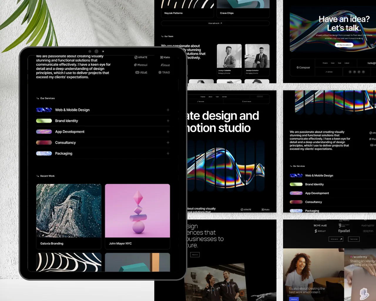
A high-end UI/UX design created for a modern creative studio website. The interface uses dark-mode aesthetics, clean grids, and strong typography to showcase projects in a bold and visually engaging way. Designed to highlight creativity while keeping the experience smooth and intuitive across all devices.
Project Overview
The Elegant Creative Agency Website is a high-end UI/UX design created for a modern digital studio looking to showcase its work with impact. The interface features dark-mode aesthetics, bold typography, clean grids, and immersive visuals to highlight creative projects in a visually compelling manner.
The client is a boutique design studio specializing in brand identity and motion graphics. They wanted a website that would itself serve as a portfolio piece — something that would make visitors say "I want my project to look like THIS." The existing website was a light-themed Squarespace site that looked clean but forgettable, blending in with hundreds of other agency sites.
We designed a dark-mode-first experience in Figma that uses dramatic contrast, cinematic transitions (specified via animation notes for developer handoff), and a portfolio-centric layout where the work speaks first and the navigation gets out of the way. The design system includes 20+ unique screens, a dark/light mode toggle specification, and micro-interaction annotations.
The website is built to feel premium, intuitive, and highly interactive — giving visitors a smooth browsing experience while enhancing the agency's brand identity. It balances artistic expression with functional clarity to ensure both inspiration and usability, with every pixel placement intentional and every interaction purposeful.
The Challenges
The problem we faced.
The previous layout lacked personality, failing to reflect the studio's design capabilities — it could have belonged to any business, from a law firm to a dental clinic. There was nothing distinctly "creative studio" about it.
Portfolio pieces weren't displayed in a visually engaging or structured way — projects were listed in a standard grid with uniform card sizes, giving equal visual weight to a major brand redesign and a simple logo update.
Earlier versions attempted dark themes but lacked contrast and readability — text was too light on slightly-darker backgrounds, interactive elements were invisible, and the overall effect felt muddy rather than elegant.
Users had difficulty understanding services, categories, and project types — there was no clear distinction between brand identity, motion graphics, UI/UX design, and illustration services.
The navigation didn't support immersive browsing — clicking on a project opened a new page that broke the visual flow, and there was no way to browse between projects without going back to the grid.
There was no clear path from browsing the portfolio to initiating a conversation — the contact page was generic and gave no indication of what information the studio needed to provide a useful response.
The Solutions
What we built instead.
A dark-mode visual identity with an elegant, high-contrast dark theme (true black backgrounds with carefully calibrated gray tones), strong expressive typography (Clash Display for headlines), and a premium visual style that creates a gallery-like atmosphere.
A modern portfolio showcase with variable-size grid layouts (hero projects get full-width treatment), smooth cursor-following hover animations, large immersive imagery, and project detail pages with narrative structure — problem, approach, and outcome.
Clear, minimal navigation with service categories organized logically in a slide-out side panel, faster access to projects and contact through persistent floating elements, and reduced visual clutter that lets the work breathe.
A mobile-optimized creative experience with responsive grids that adapt from multi-column desktop to single-column mobile, smooth animations that degrade gracefully on lower-powered devices, and tablet-friendly layouts for client presentation scenarios.
A project-to-project browsing flow with "next/previous" navigation, related projects suggestions, and a cinematic transition between project detail pages — keeping visitors immersed in the portfolio without navigation interruptions.
A project-scoped contact flow embedded at the bottom of every portfolio page — "Like this? Let's make yours." with pre-filled project type based on what the visitor was just viewing, reducing friction between inspiration and action.
Project Outcomes
The results, measured after launch.
Four numbers that summarize what changed once the system went live.
Tools & Technologies
What this project was built with.
More Work
Other real projects.
Start Here
Bring us the problem.
We'll bring back a scoped plan.
A structured conversation about your product — your users, your workflows, your constraints. We scope what should be built first, what can wait, and what it takes to ship it.