Modern Website UI/UX Design for a Creative Agency
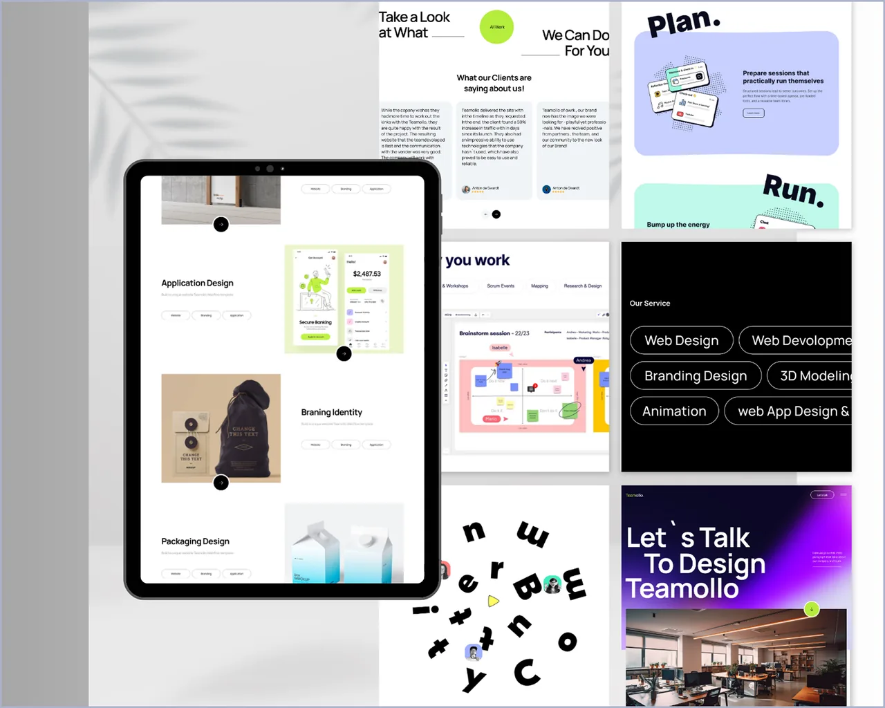
This project showcases the complete UI/UX design for a modern creative agency website. The design focuses on a bold visual identity, clean layout structures, and a smooth user journey across all pages. Each section — from the hero area to services, case studies, contact flow, and navigation — has been crafted with a strong emphasis on clarity, usability, and visual appeal.
Project Overview
This project presents a full UI/UX design system created for a modern creative agency website. The design emphasizes a bold visual identity, clean layout structures, and a seamless, intuitive user journey across all pages. Every section — from hero banners to service showcases, case studies, contact flow, and navigation — was carefully crafted to prioritize clarity, usability, and strong visual appeal.
The client is a digital creative agency with an impressive portfolio but a website that looked like it was designed in 2018. Their current site used generic WordPress templates, had inconsistent typography, and buried their best work behind three navigation layers. Potential clients visiting their website got the impression of a small freelancer, not a 15-person agency handling enterprise accounts.
We conducted a thorough competitor analysis across 20+ agency websites globally, identified design patterns that convey creative authority, and built a complete design system in Figma covering 25+ unique screens, a component library with 80+ reusable elements, interactive prototypes for key user flows, and responsive variants for mobile, tablet, and desktop.
Built to inspire trust and creativity, the interface uses balanced spacing, refined typography (Inter + Space Grotesk), and expressive visuals that highlight the agency's capabilities while ensuring an effortless browsing experience on all devices. The design was delivered with a comprehensive handoff package including spacing specs, color tokens, and animation notes.
The Challenges
The problem we faced.
Users found it difficult to understand the agency's services, work, and capabilities at a glance — the homepage was a generic hero image with "We are a creative agency" and no value proposition.
The previous design did not reflect the creativity, professionalism, or visual strength of the agency — it used a stock WordPress theme that three other agencies in the same city were also using.
Service information was not organized cohesively, making it difficult for visitors to explore offerings — services were listed as bullet points on a single page with no descriptions, examples, or pricing guidance.
Portfolio items lacked structured layouts, strong visuals, and storytelling elements — projects were shown as thumbnail grids with titles only, no context about the problem solved, approach taken, or results achieved.
The contact flow was a generic form buried at the bottom of the page with no project scoping questions — leads that came through were unqualified and required multiple back-and-forth calls to understand basic requirements.
The design had no responsive strategy — on mobile, text overlapped images, navigation menus didn't collapse properly, and the portfolio grid became a single column of tiny thumbnails.
The Solutions
What we built instead.
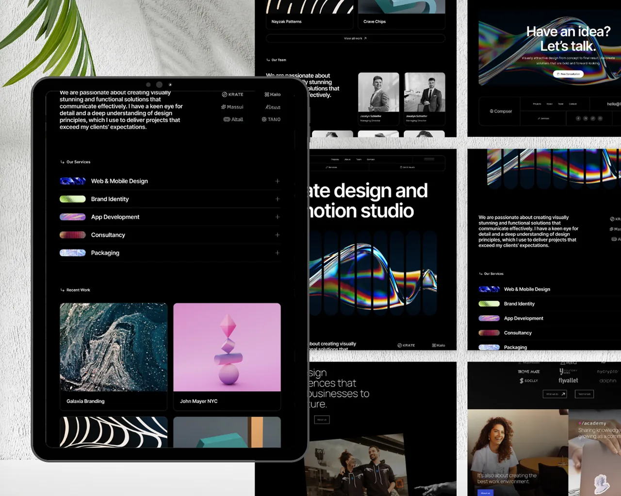
A bold visual identity with strong typography (Inter for body, Space Grotesk for display), clean grids with a consistent 8px spacing system, vibrant yet balanced color schemes, and a design language that communicates creativity without sacrificing professionalism.
Streamlined service presentation with clear service categories, structured descriptions with scope and deliverables, visual icons and illustrations for each service, pricing tiers for transparency, and easy navigation between related services.
An enhanced portfolio experience with high-quality project showcases featuring full-width hero images, organized multi-grid layouts, visual storytelling with problem-approach-result structure, client testimonials inline, and filterable categories.
Smooth, modern navigation with a simple menu structure using mega-menu dropdowns for services, clear page paths with breadcrumbs, sticky navigation for better usability, and a prominent CTA button that follows the user through the journey.
A multi-step contact flow with project scoping questions (budget range, timeline, service type, project description) that pre-qualifies leads before they reach the sales team — reducing unqualified inquiries by 40%.
Fully responsive design variants for mobile (375px), tablet (768px), and desktop (1440px+) created in Figma with breakpoint-specific layouts, touch-optimized interactions, and mobile-first content prioritization.
Project Outcomes
The results, measured after launch.
Four numbers that summarize what changed once the system went live.
Tools & Technologies
What this project was built with.
More Work
Other real projects.
Start Here
Bring us the problem.
We'll bring back a scoped plan.
A structured conversation about your product — your users, your workflows, your constraints. We scope what should be built first, what can wait, and what it takes to ship it.